

I know, I know. This isn't about CSS Grid as I had promised in my previous article. But before you scold me, maybe let's have a little fun with a little game I think could be very helpful in cementing your knowledge of CSS Flexbox in a simple and interactive way (Flexbox can be a little overwhelming owing to its many properties, but this will make it better, I promise.). Then later, maybe you could forgive me? Pretty, please?
Flexbox Froggy, created by Thomas Park, is quite simply a fun way to learn how to format web content. Basically, there's a bunch of frogs chilling in a pond, on their lily pads; but occasionally, they wander off and forget their way back home (said lily pads). What a bunch of dummies, huh? Even worse, they sometimes go off partying, and end up crashing at other froggies' homes. Well, you need to help them get back to their respective lily pads over 24 levels, using CSS code, particularly Flexbox properties. Flexbox Froggy is inspired by other web literacy games such as CSS Diner and Erase all Kittens, as well as the classic arcade game, Frogger.
You'll use a selection of both flex container and item properties to successfully complete the game:
justify-contentalign-itemsflex-directionalign-selfalign-contentflex-wrapflex-floworder
I'll only comment on a few levels that I found interesting, or whose solutions I thought were noteworthy.
1. Level 10
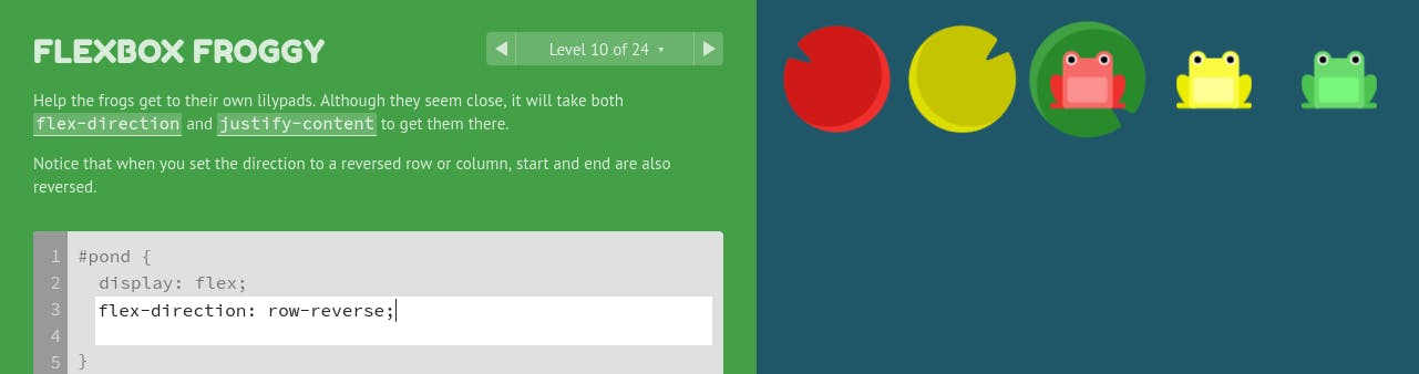
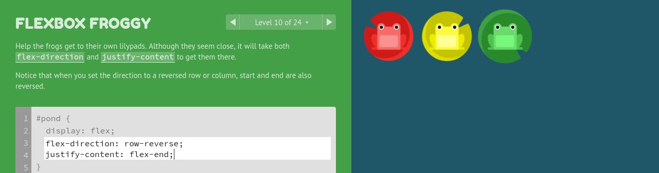
When you set the direction to a reversed row or column, flex-start and flex-end are also reversed. I'll demonstrate:
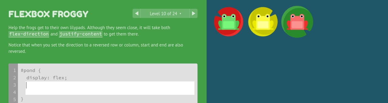
Notice that when I set flex-direction to row-reverse, the froggies move to the right side (end) of the pond. Unlike in the default flex-direction, row, the right side will be the new flex-start since that's where the main axis will now begin.
If I now set justify-content to flex-end, the frogs will move to the left side of the pond which is usually, by default, the start.
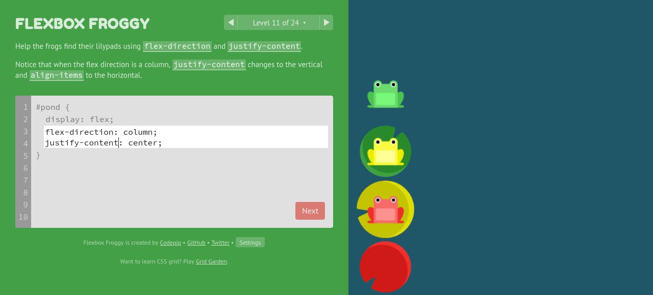
2. Level 11
When the value of flex-direction is column, justify-content changes to vertical and align-content to horizontal. Again, this is because of the change in the flex container's axes, i.e, the main axis (axis along which the flex items are placed) becomes the vertical axis as opposed to the horizontal one in the case of flex-direction: row | row-reverse.
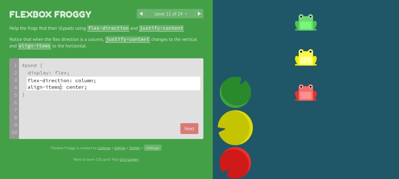
align-items is the opposite of justify-content in the sense that it defines how space is distributed between flex items in the flex container, along the cross axis. When I set its value to center, given that the flex-direction is column, the froggies will move horizontally (new cross axis) to the center of the pond.
Read the Flex Implementation and General Layout section of my previous article to get a better understanding of the importance of axes in CSS Flexbox.
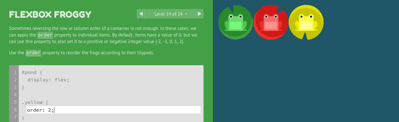
3. Level 14
Remember: By default, flex items have a value of 0. However, we can use the order property to position them (frogs, in our case) on towards either side of the pond using either positive or negative integer values.
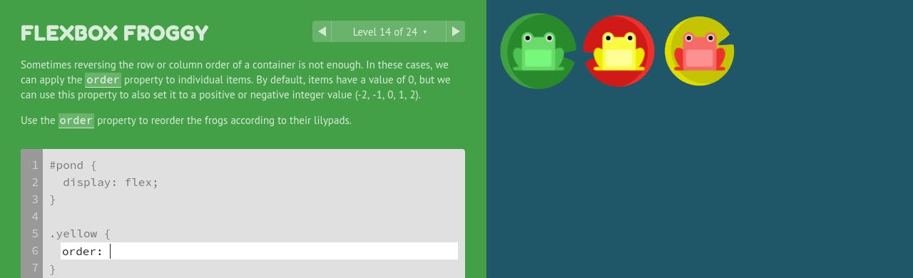
#pond {
  display: flex;
}
.yellow {
  order: 2;
}
4. Level 21: align-items vs align-items
Whereas align-items determines how flex items as a whole (not individually as in align-self), are aligned within the flex container, align-content determines the spacing between lines. That means that in the absence of multiple lines, i.e when there's only one line (flex items don't wrap to the next line), the align-content property has no effect on these items.
Well, 'nough said. Now, go play! Make them froggies smile! :D
If you enjoyed Flexbox Froggy, you might want to check out Codepip to find other web development games.
Other links you might find useful:
thomaspark.co/2015/11/learning-css-layout-w..
Good luck!