


The CSS Flexible Box Module, or Flexbox, is a modern, one-dimensional layout model that provides an efficient way to align and distribute space among items in a container. It's "flex" because:
Of its capability to do so even when the size of these items is unknown and/or dynamic. The layout allows the container to adjust the height or width of items, and even their order to fit into or fill the available space. This means that a container may grow or expand an item's width/height to fill extra space, or it could shrink it to prevent overflow. This is very helpful in responsive web design i.e. in accommodating all kinds of display devices (laptops, mobile phones, tablets...) with different screen sizes. And all these are made possible by a myriad of Flex properties which are divided into container properties and Flex item properties. But more on that later.
It's direction-agnostic. Unlike more tradition CSS layout methods, like
inlineorblock, which are horizontally-biased and vertically-biased respectively, the flex layout is free from any directional constraints. This means that you can lay out your elements in either rows or columns (one-dimensional). Websites and web applications are continually becoming more and more complex; too complex for legacy layout modules such as floats, HTML tables and single properties like,inline,blockorinline-block, to handle, especially apropos resizing, orientation, shrinking and stretching. Flexbox exists to address this problem.
Flex Axes and General Layout
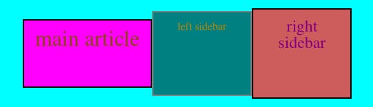
Like in any other grid-based design layout, we have to think of Flexbox in terms of axes, which would form the basic structure or skeleton of our user interface. And, as I had mentioned earlier, flex elements can be laid out in rows or columns; so, there are two axes: the main axis and cross axis. On these axes would then reside the flex container, which is the parent element or general area laid out using flexbox. Inside the flex container would be the flex items, which are the child items or rather the content of the container (text, images, anything). These flex items can then be moved around within the container depending on what we need.
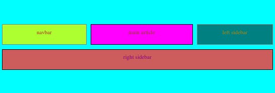
Here's how a flexbox layout might look like:
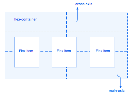
Due to the aforementioned 1D characteristic of flexbox, flex items can be placed either horizontally (row) or vertically (column). The axis along which the flex items are placed would be our main axis, whereas the one perpendicular to it would be the cross axis. Since our items are placed on a row in the illustration above, then the horizontal axis is the main axis.
Flex Implementation
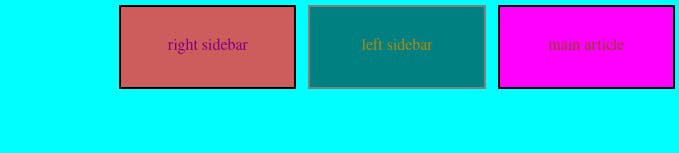
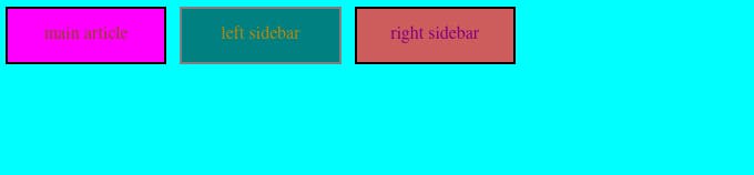
But first things first. To create a flex container, or turn a box into a flexbox, we set the CSS display property to flex or flex-inline. This would not only define the flex container but also make the direct children of that container flex items. Let's use a simple example with three flex items:
HTML
<section class="container">
<!--<header class="navbar">navbar</header>-->
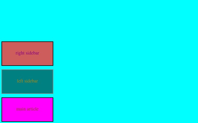
<article class="main-article">main article</article>
<aside class="left-sidebar">left sidebar</aside>
<aside class="right-sidebar">right sidebar</aside>
<!--<footer class="footer">footer</footer>-->
</section>
CSS
.container {
  display: flex; /*or inline-flex*/
}

Container Properties
flex-direction
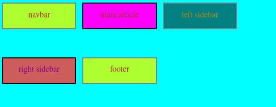
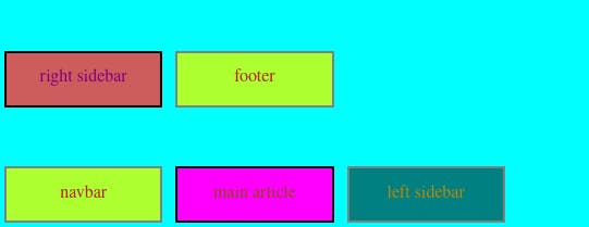
Flexbox's main axis is defined by the flex-direction property, which has four possible values that determine the direction towards which the flex items will be placed within the flex container:
row- This is the default value. If the direction of the main axis is right to left (rtl), then the flex items will be placed rtl. If the main axis' direction is left to right (ltr), then the flex items will be placed ltr.row-reverse- If main axis is rtl, then flex items will be ltr.column- Likerow, but top to bottom.column-reverse- likerow-reverse, but bottom to top.
.container {
  display: flex; /*or inline-flex*/
  flex-direction: row-reverse;
}
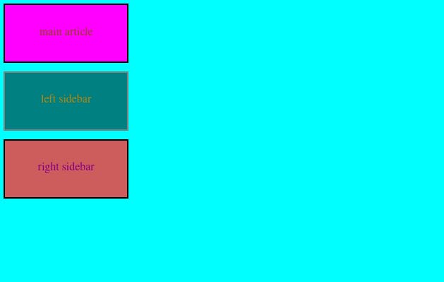
.container {
  display: flex; /*or inline-flex*/
  flex-direction: column;
}
.container {
  display: flex; /*or inline-flex*/
  flex-direction: column-reverse;
}
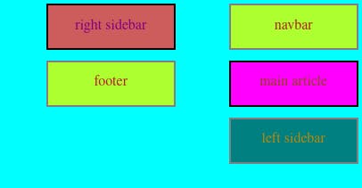
flex-wrap
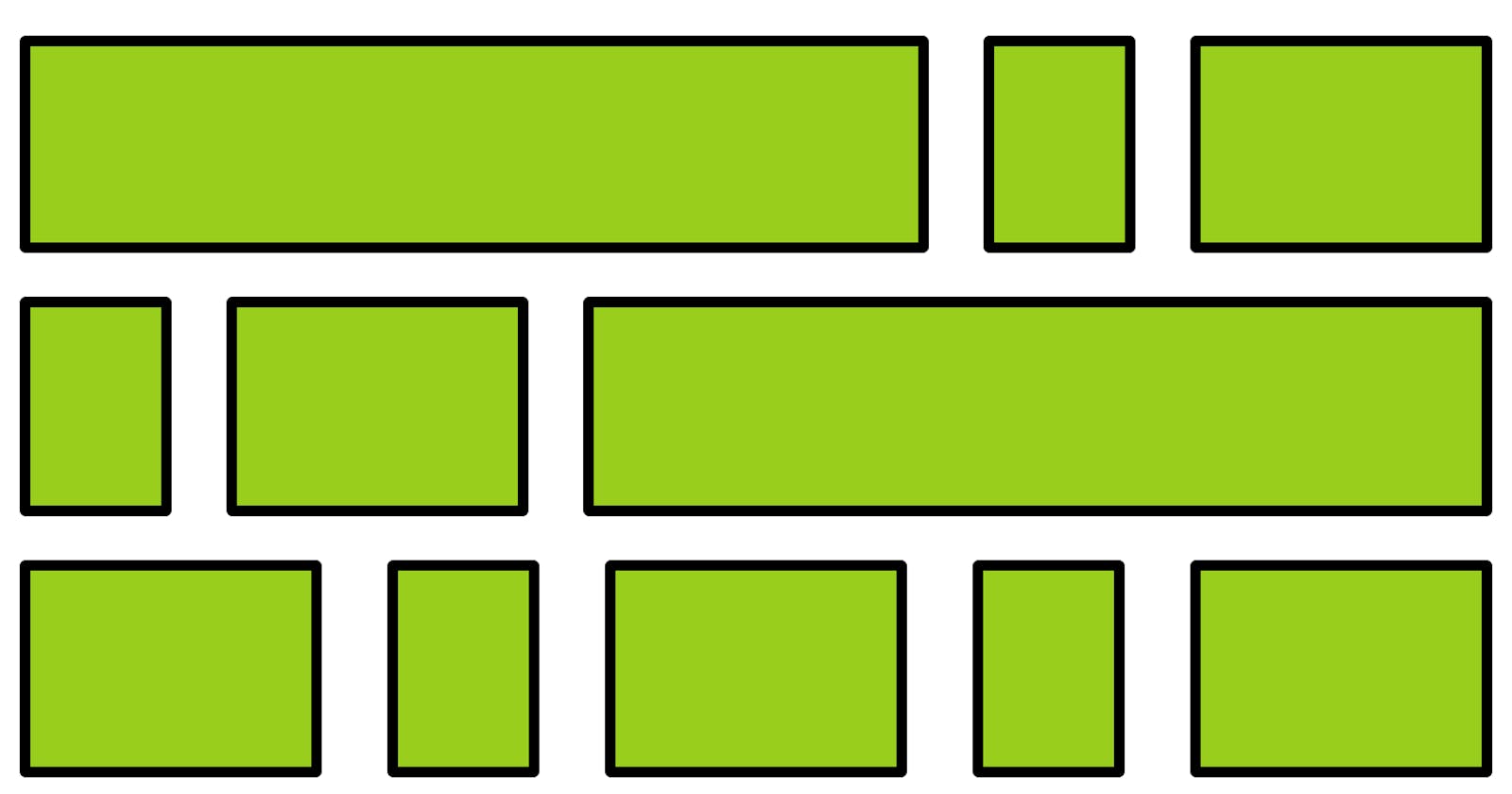
flex-wrap is a property that specifies whether flex items are to be forced into a single line or if they can be wrapped into multiple lines. By default, flex items will try to all fit into one line. This property has three values:
nowrap(default)- all flex items on a single line.wrap- items wrap onto multiple lines, from top to bottom.wrap-reverse- items wrap onto multiple lines from bottom to top.
.container {
  flex-wrap: wrap;
}
.container {
  flex-wrap: wrap-reverse;
}
flex-flow
flex-flow is a shorthand for both flex-direction and flex-wrap which, together, determine the container's main and cross axes. The default value is row nowrap.
Example:
.container {
  flex-flow: column wrap-reverse;
}
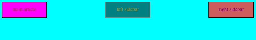
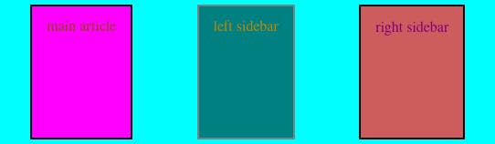
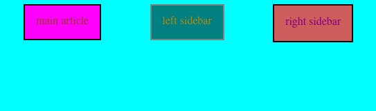
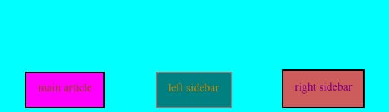
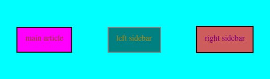
justify-content
This property defines how space is distributed between flex items in the flex container, along the main axis. It allows us to allocate extra space on the main axis. I will highlight six values of this property that I find most useful:
.container {
  justify-content: flex-start | flex-end | center | space-between | space-around | space-evenly;
}
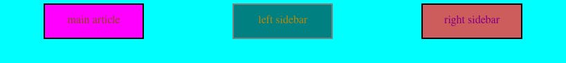
flex-start(default)- aligns content from the start of the main axis or flex direction.
flex-end- aligns content from the end of the main axis.
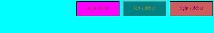
center- aligns content at the centre or middle of the line.

space-between- allows us to distribute extra space between our flex items, but not on the edges. This means that the first item will be on the start line, and the last one will be on the end line.
space-around- Unlikespace-between, space is also allocated on the edges. All items have the same amount of space around it (on both sides). Visually, however, all the spaces won't be equal since the first and last items will have only one unit of space against the start and end lines (edges) respectively, but will have two units of space between themselves and the adjacent items since they also have their own spacing.
If we wanted to apply equal spacing around our items, though, we can apply the space-evenly property to achieve that.

align-items
This property defines how space is distributed between flex items in the flex container, along the cross axis. It's like justify-content, but for the perpendicular axis. I'll also highlight six important values for this property, starting with the default value, stretch.
.container {
  display: flex;
  flex-flow: row wrap;
  justify-content: space-around;
  align-items: stretch | flex-start | flex-end | center | baseline;
}
stretch(default)- the content stretches to fit the container. The items grow to fill the entire container along the cross axis.
flex-start- items are placed at the start of the cross axis.
flex-end- items are placed at the end of the cross axis.
center- flex items are placed at the centre of the cross axis.
baseline- sometimes, flex items, say text, have different sizes.
 We can place these items such that their baselines align using this property.
.container {
  display: flex;
  flex-flow: row wrap;
  justify-content: center;
  align-items: baseline;
}
align-content
This property defines how space is distributed between rows in a flex container, along the cross axis. It works similarly to the way justify-content aligns items along the main axis. The default value is normal.
.container {
  display: flex;
  flex-flow: row wrap;
  justify-content: center;
  align-items: center;
  align-content: normal |flex-start | flex-end | center |stretch | space-between | space-around | space-evenly;
}
If you compare align-items: center above and align-content: center below, you will notice that in the latter, the extra space between the two rows has been eliminated.
Item Properties
These are properties applied to the individual items inside a flex container. Within the container, we may want various items to behave in different ways. These properties allow us to target specific items and manipulate them accordingly.
align-self
This property allows us to override the default or set value foralign-items for individual flex items.
.main-article {
  align-self: auto | flex-start | flex-end | center | baseline | stretch;
}
.container {
  display: flex;
  flex-flow: row wrap;
  justify-content: center;
  align-items: flex-end;
}

.main-article {
  align-self: flex-start;
}
flex
flex is a shorthand for three different properties: flex-grow, flex-shrink and flex-basis. It defines how a flex item will grow or shrink to fit the available space in a container.
If we pass three values in the property, then they will be flex-grow, flex-shrink and flex-basis, in that order. For example:
.container {
  flex: 2 2 10%;
}
However, if we pass in a single or double values, it will be considered as follows:
Unitless number e.g. 2-
flex-grow.Number with units e.g. 50px, 30%, 2em, 40vh-
flex-basis.Two unitless numbers:
flex-grow|flex-shrink.Two values, one unitless the other with units e.g. 2 20%-
flex-grow|flex-basis.
Read more here .
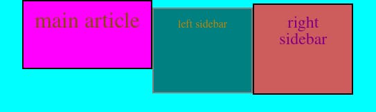
flex-basisdefines the ideal starting size or default size of a flex item before the remaining space is distributed along the main axis. This means that it could be a length or width depending on the direction of the main axis (whetherflex-directionis set toroworcolumn). The value for this property can be a hard-coded length/width e.g. 200px, a percentage or a keyword e.g.auto,initial,contentornone. If, for example, we have four items and set our value to 25%, then they will fit perfectly into the container and no extra space will remain. However, if we change our value to 50%, depending on whether ourflex-flowproperty is set towrapornowrap, the items will either grow to occupy 50% of the container then wrap over to the next line, or shrink to fit into the single line. The next two properties will cover these situations.
!Post Scriptum: flex-basis always overrides width or height properties in a flex container.
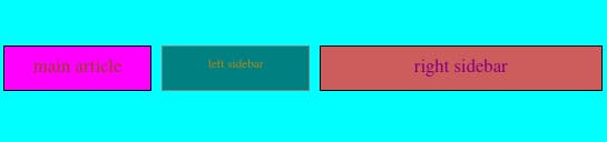
flex-growdictates how unused space should be distributed amongst flex items, if necessary. Unlikeflex-basiswhich uses actual units (pixels, percetages, etc.),flex-growuses a unitless value that serves as a ratio or proportion.This means that space is allocated to an item in relation to another items. Setting the value toflex-grow: 1;, for example, would give all items an equal share of the extra space. But if we allocated different values for different items as follows, then most of the extra space will be allocated to the element in the main-article class which will take up 4 times as much space as the sidebar elements (if possible).
!Post Scriptum: Negative numbers are invalid.
.container {
  display: flex;
  flex-flow: row wrap;
  justify-content: space-between;
  align-items: flex-start;
  flex-basis: 50px;
}
.navbar {
  flex-grow: 2;
}
.main-article {
  flex-grow: 4;
}
.left-sidebar {
  flex-grow: 1;
}
.right-sidebar {
  flex-grow: 1;
}
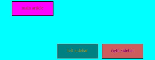
flex-shrinkdictates how flex items should shrink if there isn't enough space in the container to fit them. Just like withflex-grow, it uses ratios to determine how much one item should shrink in relation to the others in the container. If all items are set to the same value, then they'll all shrink in the same way; however, if one item is set to a ratio of 1 and another 5, then the latter will shrink a lot more than the former. Five times more space will be removed from the second item than from the first, if possible.
.container {
  flex-basis: 50px;
}
.main-article {
  flex-shrink: 1;
}
.left-sidebar {
  flex-shrink: 5;
}
.right-sidebar {
  flex-shrink: 5;
}
!Post Scriptum: Negative numbers are invalid.
order
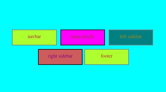
By default, flex items are laid out in the source order (as it appears in our markup). However, the order property lets us reorder these items, or specify the order in which we want them to appear in our flex container. This is very useful, for example, in responsive web design whereby we may want some content to be displayed differently in different screen sizes. In our example, we may, for instance, want to prioritise our main article, which is the most important thing on our website, on smaller screens, like mobile phones rather than the sidebar, which can come in later.
We assign an order (number value) to individual item.
.main-article {
  order: -1;
}
!Post Scriptum: All items, by default, have an order of 0.
We can use the order property along with media queries to attain the visual display we want on different screen sizes.
@media screen and (max-width:575px) {
    .container {
        flex-direction: column;
    }
    .main-article {
        order: -1;
    }
}
I will talk about another modern, grid-based layout system, CSS Grid in my next post. Ta-ta for now, reader mine. :)
Links you might find useful: